My book the The Knock On is now available in-store and on-line exclusively from Little Deer Comics.
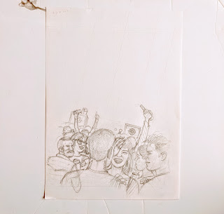
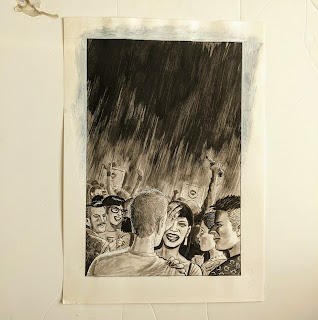
Here's some process on the cover design.
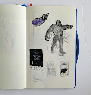
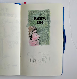
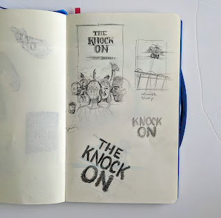
It all starts as doodles in the sketchbook.
Rather than trying to tell a story with the cover as is my first instinct, I wanted for this book an image that might be more of a mood piece with plenty of space included.
The pointing bouncer figure was considered initially as was as a 'big head'.
The crowd image was interesting but once skewed, as if looking through someone's eyes, it really became a winner.
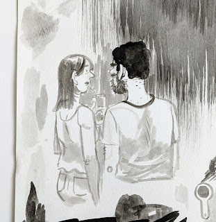
For the finish I wanted to try an ink wash style for a change.
I was afraid however I'd be too timid on the final piece. I decided to pencil it fairly tightly and then lightbox over the top so I could take the pressure off and do another take if needed.
The first pass ended up just fine.
The speakers were added to the pencils to make the skew more obvious.
The title was originally going to skew in line with the scene but it was a bit much in the end.
FYI The text styling is a fairly flagrant 'homage' to the Paul Bacon designed covers of Philip Roth's novels of the 70's and 80's.
The speakers were added to the pencils to make the skew more obvious.
The title was originally going to skew in line with the scene but it was a bit much in the end.
FYI The text styling is a fairly flagrant 'homage' to the Paul Bacon designed covers of Philip Roth's novels of the 70's and 80's.
But hand drawn of course.


